
My Experience with Text-to-Speech Tools
I have experimented with various text-to-speech tools for my own personal pleasure; I found them particularly handy when exploring ways to read textbook chapters without losing concentration. Nonetheless, I acknowledge that the use of Text-to-speech tools opens up the learning and knowledge retention abilities to those outside of the classroom as well and can be used in various everyday tasks. The text-to-speech tools that I experimented with were both Google Chrome extensions: TTSReader and ReadAloud.
ReadAloud provided a simple text-to-speech experience that was able to decode any article that I was reading with ease.
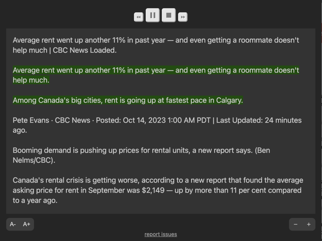
Figure 1. ReadAloud Chrome extension interface
TTSReader provided a comprehensive text-to-speech experience that allowed for more customization in favor of the user.
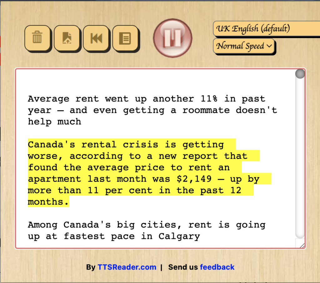
Figure 2. TTSReader Chrome extension interface
After trying both extensions, I found TTSReader to be the better extension due to the presence of features that work in favor of user experience. ReadAloud gives users the ability to play and pause the audio feed, enlarge the interface window, and enlarge word log font size. While these can be a sufficient amount of options that one may need when using one of these tools, TTSReader offers many more features that simply elevate the user experience. For example, TTSReader allows the user to change the accent of reader; including different voices and accents removes a potential language barrier that the user can have when interacting with the content and allows them to process the information as intended. I used the UK English voice for my playback as I found it soothing to listen to for longer periods of time; users will find it beneficial to alter the speaker accent to one that they will want to listen for long periods as it adds to the overall experience. Additionally, it also gives the user the ability to change the playback speed of the reader. As seen in Cognitive Load Theory, allowing the user to change the pace of their lessons removes intrinsic cognitive load and ensures proper processing of the right information. TTSReader also gave users the ability to restart the reading from the beginning, clear the text log, and pause/play as needed.
Wave Accessibility Tool
The Wave accessibility tool highlighted errors and alerts that tend to be an afterthought when I put my blog posts and general text documents together. The first error that it spotted was the absence of alternative text with the featured image in my article. This tool smartly spotted that it was a practical design choice that I looked over. Alt text is important as it coincides with Mayer’s spatial contiguity principle and ensures that the text is supplemental information to message of the image.

Figure 3. Wave Accessibility Checker highlighting the absence of alt text
The next error that was spotted was an not an absence, but rather, a presence of underlined text in each of the subheadings of my article. From an accessibility standpoint, this can be problematic as underlined text typically indicates hyperlinks or links to other websites, which strays from the true intent of the use of underlining which was differentiation from regular text.
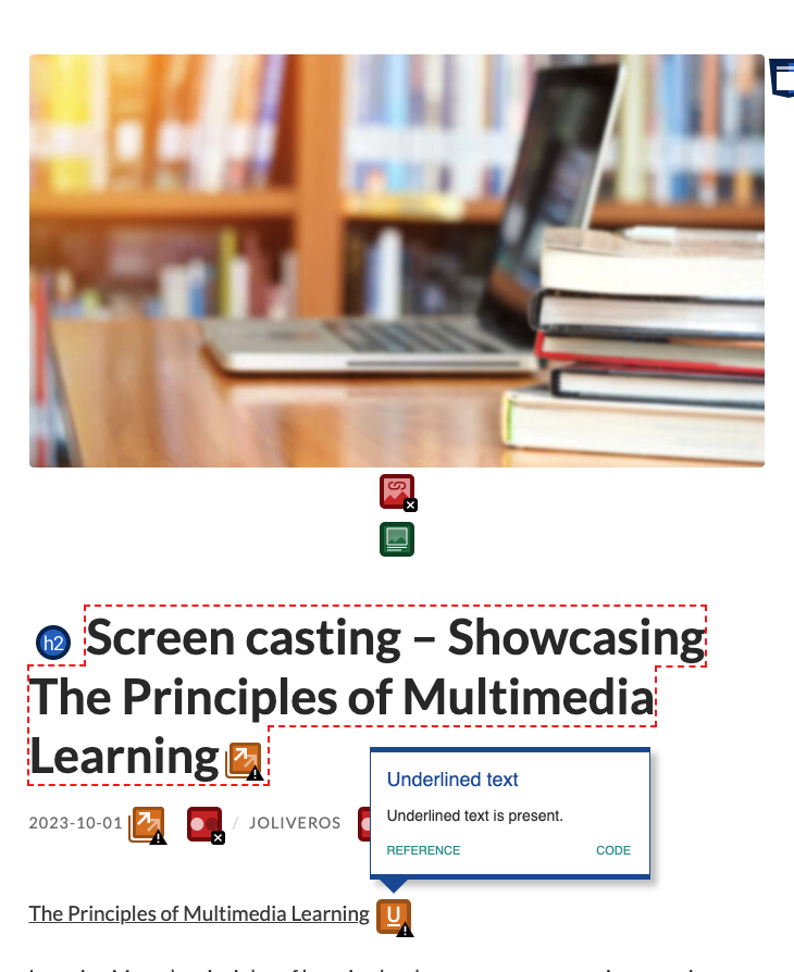
Figure 4. Wave Accessibility Checker highlighting the presence of underlined text
With any encountered errors, the tool goes on to explain the error, it’s significance, and how to correct it. To conclude, the Wave accessibility tool helps users correct any habitual accessibility errors to ensure the readers are gathering the proper information from the body of work.
Creating an Infographic with Canva
I used a template on Canva to create an infographic about Bloom’s Taxonomy that I learned in EDCI 339. Named after Benjamin Bloom, these six elements classify the different learning outcomes and skills for students. The ideas expressed in Bloom’s Taxonomy closely relate to those of Cognitive Load Theory in that we can use CLT to tailor our lessons so that students are learning effectively and efficiently, and Bloom’s Taxonomy outlines learning goals at each of its respective hierarchical levels throughout the lesson.
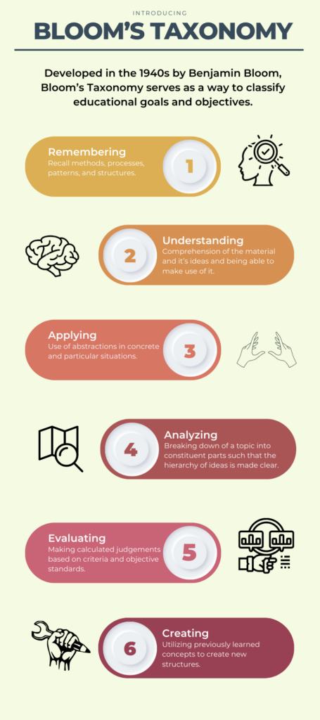
Figure 5. Canva Infographic about Bloom’s Taxonomy
The practical design principles that I focused on were:
- Alignment – the six elements are displayed in a logical manner and ensure a clean viewing experience. The reader is able to interpret each symbol as supplementary as they align with their of their respective elements beside them.
- Repetition – the same structure, i.e. coloured oval, inner circles, and number, follow for each of the six elements. This repetition lets the reader draw patterns between the content and know which ideas are correlated to one another.
- Hierarchy – the elements are presented in descending order according to the way that each learning outcome unfolds in the lesson. This ensures the reader traverses through the steps in the proper order laid out for them when creating learning outcomes.
- Color – the same warm color palette is used for the elements in descending order to show a pattern between ideas. The colours become warmer as you traverse the graphic and learn more about the topic. I chose the warm color palette since it evokes a passionate and uplifting emotion to the lesson.
- Simple Imagery – these simple but visually intuitive images beside each of the elements demonstrate the type of action being performed. It gives the reader an immediate grasp of the information displayed if they are unable to interpret it verbally.